
Appearance
✨ 过渡 👌
核心概念
CSS Transition(过渡)是一种让元素从一个状态平滑过渡到另一个状态的技术,它能让页面交互更加自然流畅。
1. 过渡的基本概念
过渡的本质是从一个状态过渡到另一个状态,它需要解决以下几个关键问题:
- 如何切换状态(触发条件)
- 哪些属性参与变化(
transition-property) - 用多长时间完成过渡(
transition-duration) - 过渡的速度曲线(
transition-timing-function) - 何时开始过渡(
transition-delay)
1.1 过渡的工作原理
css
/* 基础过渡语法 */
.element {
  /* 初始状态 */
  width: 100px;
  height: 100px;
  background-color: blue;

  /* 定义过渡效果 */
  transition: all 0.3s ease;
}

.element:hover {
  /* 目标状态 */
  width: 200px;
  height: 200px;
  background-color: red;
}
2. 状态切换方式
2.1 CSS 伪类触发
最常用的触发方式是使用 CSS 伪类:
css
/* 悬停触发 */
.button:hover {
  background-color: #007bff;
  transform: scale(1.05);
}

/* 焦点触发 */
.input:focus {
  border-color: #007bff;
  box-shadow: 0 0 0 3px rgba(0, 123, 255, 0.25);
}

/* 激活状态触发 */
.button:active {
  transform: scale(0.95);
}
2.2 JavaScript 动态控制
通过 JavaScript 修改类名或直接修改样式属性:
javascript
// 方法1:切换类名
const element = document.querySelector(".box");
element.classList.toggle("active");

// 方法2:直接修改样式
element.style.transform = "translateX(100px)";
element.style.backgroundColor = "red";

// 方法3:使用数据属性
element.setAttribute("data-state", "expanded");
css
/* 对应的CSS */
.box {
  transition: all 0.3s ease;
}

.box.active {
  transform: translateX(100px);
  background-color: red;
}

.box[data-state="expanded"] {
  width: 300px;
  height: 200px;
}
3. 过渡属性详解
3.1 transition-property(过渡属性)
指定哪些 CSS 属性参与过渡效果。
css
/* 所有可过渡的属性 */
transition-property: all;

/* 指定单个属性 */
transition-property: width;

/* 指定多个属性 */
transition-property: width, height, background-color;

/* 排除某些属性 */
transition-property: all;
/* 然后通过其他方式控制不需要过渡的属性 */
注意
以下属性不支持过渡效果:
displaybackground-imagecontentfont-familyvisibility(但可以通过延迟实现类似效果)
可过渡的常用属性:
| 属性类型 | 具体属性 |
|---|---|
| 尺寸 | width, height, padding, margin |
| 位置 | top, left, right, bottom |
| 变换 | transform, transform-origin |
| 颜色 | color, background-color, border-color |
| 透明度 | opacity |
| 边框 | border-width, border-radius |
| 阴影 | box-shadow, text-shadow |
| 滤镜 | filter, backdrop-filter |
3.2 transition-duration(过渡时长)
定义过渡动画的持续时间。
css
/* 秒为单位 */
transition-duration: 0.3s;
transition-duration: 1.5s;

/* 毫秒为单位 */
transition-duration: 300ms;
transition-duration: 1500ms;

/* 为不同属性设置不同时长 */
transition-property: width, background-color;
transition-duration: 0.3s, 0.6s;
3.3 transition-timing-function(时间函数)
控制过渡动画的速度曲线。
3.3.1 预定义关键字
| 关键字 | 含义 | 贝塞尔曲线 | 适用场景 |
|---|---|---|---|
linear | 匀速变化 | cubic-bezier(0,0,1,1) | 简单的位移动画 |
ease | 两头慢中间快 | cubic-bezier(0.25,0.1,0.25,1) | 默认值,通用场景 |
ease-in | 先慢后快 | cubic-bezier(0.42,0,1,1) | 元素进入动画 |
ease-out | 先快后慢 | cubic-bezier(0,0,0.58,1) | 元素退出动画 |
ease-in-out | 两头慢中间快 | cubic-bezier(0.42,0,0.58,1) | 往返动画 |
css
/* 使用预定义关键字 */
.smooth {
  transition-timing-function: ease;
}
.slow-start {
  transition-timing-function: ease-in;
}
.slow-end {
  transition-timing-function: ease-out;
}
.uniform {
  transition-timing-function: linear;
}
3.3.2 贝塞尔曲线
使用 cubic-bezier(x1, y1, x2, y2) 自定义速度曲线:
css
/* 自定义贝塞尔曲线 */
.custom-ease {
  transition-timing-function: cubic-bezier(0.68, -0.55, 0.265, 1.55);
}

/* 弹性效果 */
.bounce {
  transition-timing-function: cubic-bezier(0.175, 0.885, 0.32, 1.275);
}

/* 快速开始,缓慢结束 */
.fast-slow {
  transition-timing-function: cubic-bezier(0.25, 0.46, 0.45, 0.94);
}
3.3.3 步进函数(定格动画)
使用 steps(n, start|end) 创建逐帧动画效果:
css
/* 基础步进动画 */
.step-animation {
transition-timing-function: steps(5, end);
}
/* 打字机效果 */
.typewriter {
width: 0;
white-space: nowrap;
overflow: hidden;
transition: width 2s steps(20, end);
}
.typewriter.active {
width: 100%;
}
/* 像素风格动画 */
.pixel-move {
transition: transform 1s steps(10, start);
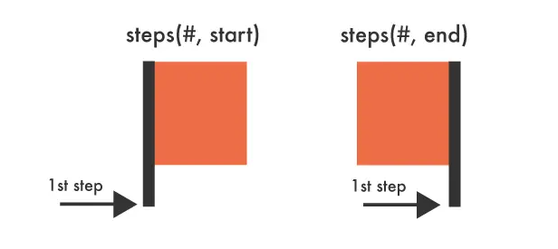
}步进函数参数说明:
- 步数(n):动画分割的步数
- 方向(start|end):
start:在每个时间间隔的开始时改变属性值end:在每个时间间隔的结束时改变属性值(默认)
应用场景
steps() 特别适用于:
- 电子钟秒针跳动
- 精灵图逐帧动画
- 打字机效果
- 像素风格游戏动画
3.4 transition-delay(过渡延迟)
控制过渡动画的开始时间。
css
/* 延迟开始 */
transition-delay: 0.2s; /* 延迟200ms开始 */
transition-delay: 1s; /* 延迟1秒开始 */

/* 提前开始(负值) */
transition-delay: -0.5s; /* 提前500ms开始 */

/* 为不同属性设置不同延迟 */
transition-property: width, height, background-color;
transition-delay: 0s, 0.1s, 0.2s;
延迟值的作用:
- 正值:延后开始过渡
- 负值:提前开始过渡(相当于跳过动画的前一部分)
- 0:立即开始(默认值)
4. 过渡简写语法
4.1 基础简写
css
/* 完整语法 */
transition: property duration timing-function delay;

/* 示例 */
transition: all 0.3s ease 0.1s;
transition: width 0.5s linear;
transition: transform 0.3s cubic-bezier(0.25, 0.46, 0.45, 0.94);
4.2 多属性过渡
css
/* 方法1:使用 all */
transition: all 0.3s ease;

/* 方法2:分别指定每个属性 */
transition: width 0.3s ease, height 0.3s ease 0.1s,
  background-color 0.5s linear 0.2s, transform 0.2s cubic-bezier(0.25, 0.46, 0.45, 0.94);

/* 方法3:分组设置 */
transition-property: width, height, background-color;
transition-duration: 0.3s, 0.3s, 0.5s;
transition-timing-function: ease, ease, linear;
transition-delay: 0s, 0.1s, 0.2s;
5. 过渡事件
CSS 过渡提供了四个 JavaScript 事件,用于监听过渡的不同阶段:
5.1 事件类型
javascript
const element = document.querySelector(".transition-element");

// 过渡开始时触发
element.addEventListener("transitionstart", (e) => {
  console.log(`过渡开始: ${e.propertyName}`);
});

// 过渡运行时触发(包括延迟期间)
element.addEventListener("transitionrun", (e) => {
  console.log(`过渡运行: ${e.propertyName}`);
});

// 过渡结束时触发
element.addEventListener("transitionend", (e) => {
  console.log(`过渡结束: ${e.propertyName}`);
  // 可以在这里执行后续操作
});

// 过渡被取消时触发
element.addEventListener("transitioncancel", (e) => {
  console.log(`过渡取消: ${e.propertyName}`);
});
5.2 事件对象属性
javascript
element.addEventListener("transitionend", (e) => {
  console.log({
    propertyName: e.propertyName, // 过渡的属性名
    elapsedTime: e.elapsedTime, // 过渡持续时间(秒)
    pseudoElement: e.pseudoElement, // 伪元素名称(如果有)
  });
});
5.3 实际应用示例
javascript
// 链式动画
function chainAnimation() {
  const box = document.querySelector(".box");

  // 第一阶段:移动
  box.style.transform = "translateX(100px)";

  box.addEventListener("transitionend", function handler(e) {
    if (e.propertyName === "transform") {
      // 移除事件监听器
      box.removeEventListener("transitionend", handler);

      // 第二阶段:改变颜色
      box.style.backgroundColor = "red";
    }
  });
}

// 加载状态管理
function showLoading() {
  const loader = document.querySelector(".loader");
  loader.classList.add("visible");

  loader.addEventListener(
    "transitionend",
    () => {
      // 过渡完成后的回调
      console.log("加载动画显示完成");
    },
    { once: true }
  ); // 只执行一次
}
6. 实际应用案例
6.1 按钮悬停效果
html
<button class="hover-button">悬停我</button>css
.hover-button {
  padding: 12px 24px;
  background: linear-gradient(45deg, #007bff, #0056b3);
  color: white;
  border: none;
  border-radius: 8px;
  cursor: pointer;
  font-size: 16px;
  font-weight: 500;
  position: relative;
  overflow: hidden;

  /* 过渡效果 */
  transition: transform 0.2s ease, box-shadow 0.2s ease, background 0.3s ease;
}

.hover-button::before {
  content: "";
  position: absolute;
  top: 0;
  left: -100%;
  width: 100%;
  height: 100%;
  background: linear-gradient(
    90deg,
    transparent,
    rgba(255, 255, 255, 0.2),
    transparent
  );
  transition: left 0.5s ease;
}

.hover-button:hover {
  transform: translateY(-2px);
  box-shadow: 0 8px 25px rgba(0, 123, 255, 0.3);
}

.hover-button:hover::before {
  left: 100%;
}

.hover-button:active {
  transform: translateY(0);
  transition-duration: 0.1s;
}6.2 卡片翻转效果
html
<div class="flip-card">
  <div class="flip-card-inner">
    <div class="flip-card-front">
      <h3>正面</h3>
      <p>这是卡片的正面内容</p>
    </div>
    <div class="flip-card-back">
      <h3>背面</h3>
      <p>这是卡片的背面内容</p>
    </div>
  </div>
</div>
css
.flip-card {
  width: 300px;
  height: 200px;
  perspective: 1000px;
  margin: 100px auto;
}

.flip-card-inner {
  position: relative;
  width: 100%;
  height: 100%;
  text-align: center;
  transition: transform 0.6s;
  transform-style: preserve-3d;
}

.flip-card:hover .flip-card-inner {
  transform: rotateY(180deg);
}

.flip-card-front,
.flip-card-back {
  position: absolute;
  width: 100%;
  height: 100%;
  backface-visibility: hidden;
  border-radius: 12px;
  display: flex;
  flex-direction: column;
  justify-content: center;
  align-items: center;
  box-shadow: 0 4px 8px rgba(0, 0, 0, 0.1);
}

.flip-card-front {
  background: linear-gradient(135deg, #667eea 0%, #764ba2 100%);
  color: white;
}

.flip-card-back {
  background: linear-gradient(135deg, #f093fb 0%, #f5576c 100%);
  color: white;
  transform: rotateY(180deg);
}7. 性能优化与最佳实践
7.1 性能优化技巧
性能优化要点
- 优先使用 transform 和 opacity:这些属性不会触发重排(reflow)
- 避免过渡布局属性:如 width、height、padding 等会触发重排
- 使用 will-change 属性:提前告知浏览器哪些属性会发生变化
- 合理设置过渡时长:过长会影响用户体验,过短可能看不清效果
css
/* 推荐:高性能过渡 */
.optimized-element {
  /* 提前声明变化属性 */
  will-change: transform, opacity;

  /* 使用 transform 代替位置属性 */
  transition: transform 0.3s ease, opacity 0.3s ease;
}

.optimized-element:hover {
  /* 使用 transform 移动元素 */
  transform: translateX(100px) scale(1.1);
  opacity: 0.8;
}

/* 避免:低性能过渡 */
.slow-element {
  transition: left 0.3s ease, width 0.3s ease; /* 会触发重排 */
}

.slow-element:hover {
  left: 100px; /* 触发重排 */
  width: 200px; /* 触发重排 */
}
8. 总结与学习建议
8.1 核心要点回顾
过渡核心概念
- 过渡本质:从一个状态平滑变化到另一个状态
- 四大属性:property(属性)、duration(时长)、timing-function(时间函数)、delay(延迟)
- 触发方式:CSS 伪类、JavaScript 动态控制
- 性能优先:优先使用 transform 和 opacity
- 用户体验:合理的时长和缓动函数
8.2 属性速查表
| 属性 | 语法 | 默认值 | 说明 |
|---|---|---|---|
transition-property | all | none | <property> | all | 指定过渡属性 |
transition-duration | <time> | 0s | 过渡持续时间 |
transition-timing-function | <timing-function> | ease | 速度曲线 |
transition-delay | <time> | 0s | 延迟时间 |
transition | <property> <duration> <timing-function> <delay> | - | 简写属性 |